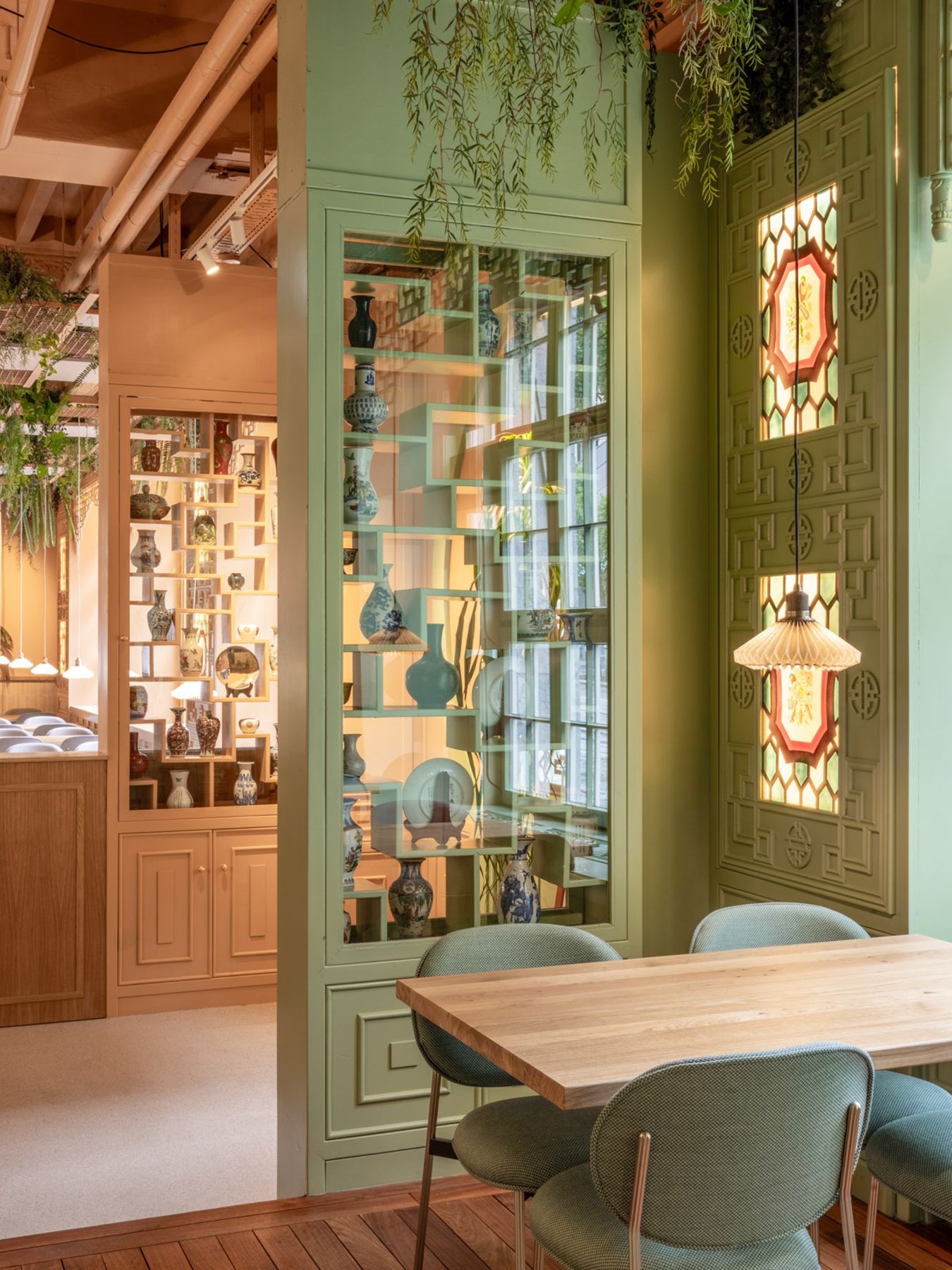
Introducing House of Ren, a captivating restaurant that matches the elegance of tradition with the allure of contemporary design.
This remarkable space which was already an esteemed Chinese restaurant got transformed to the highest standards of modern aesthetics with the new branding and interior design.
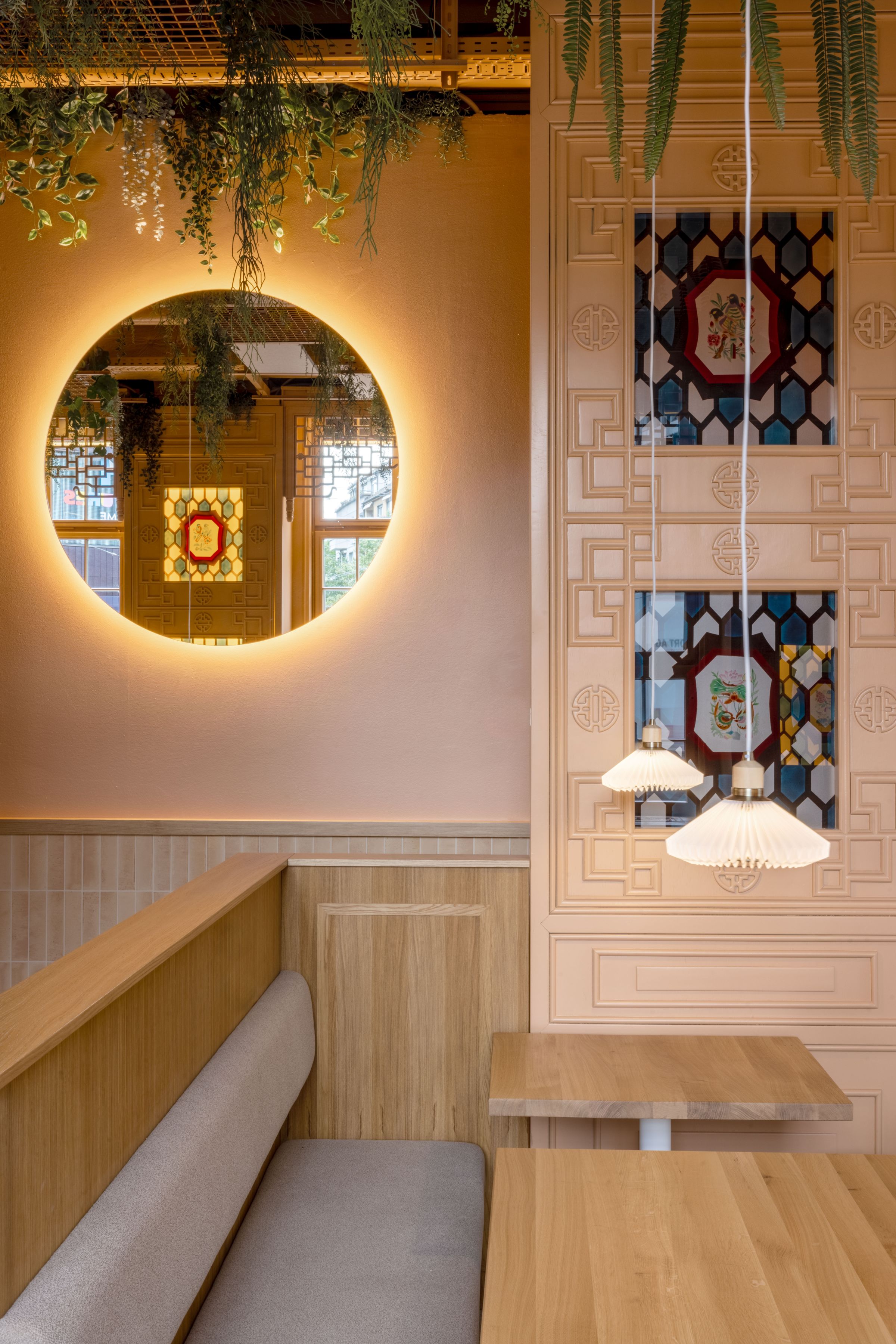
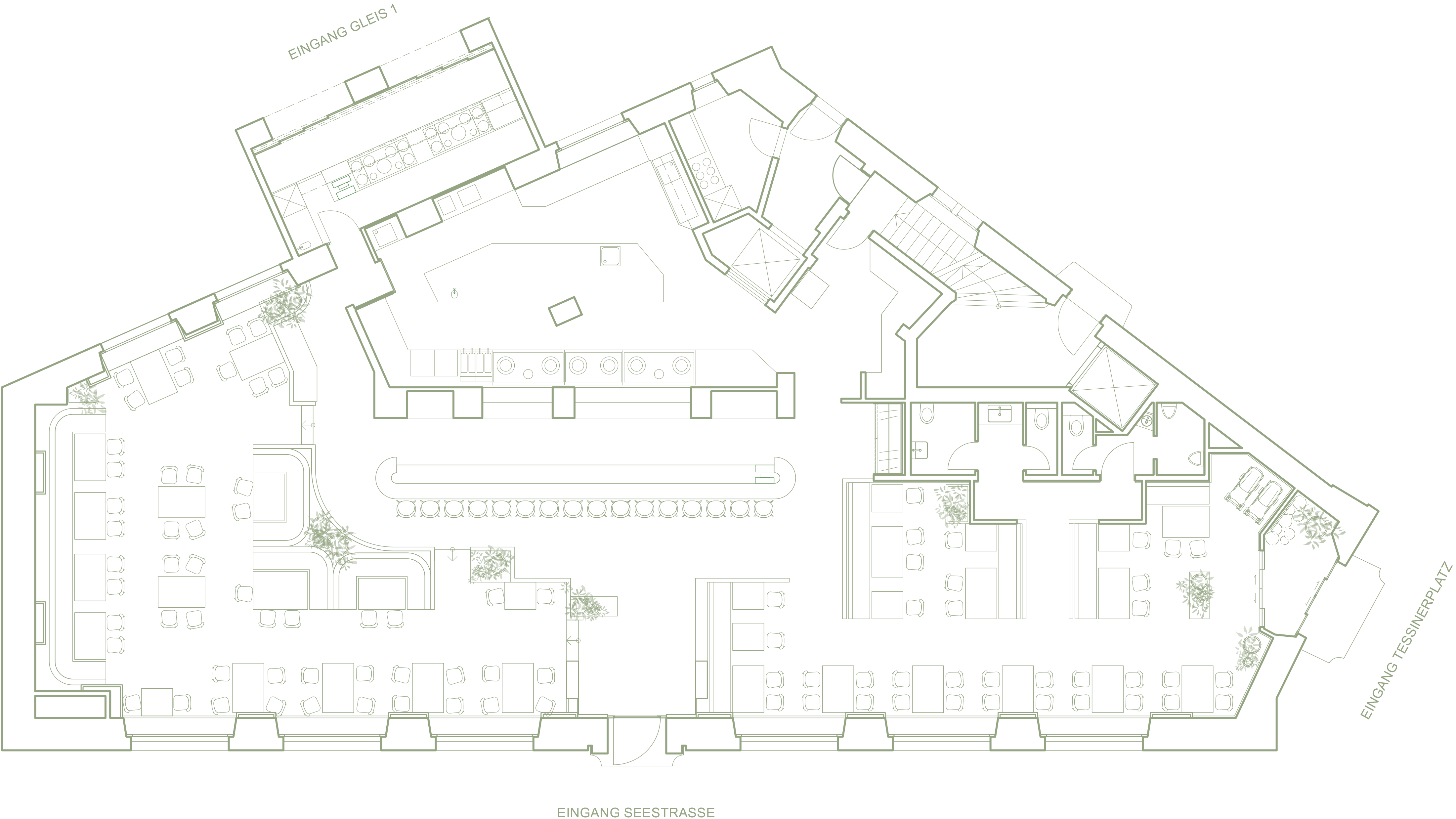
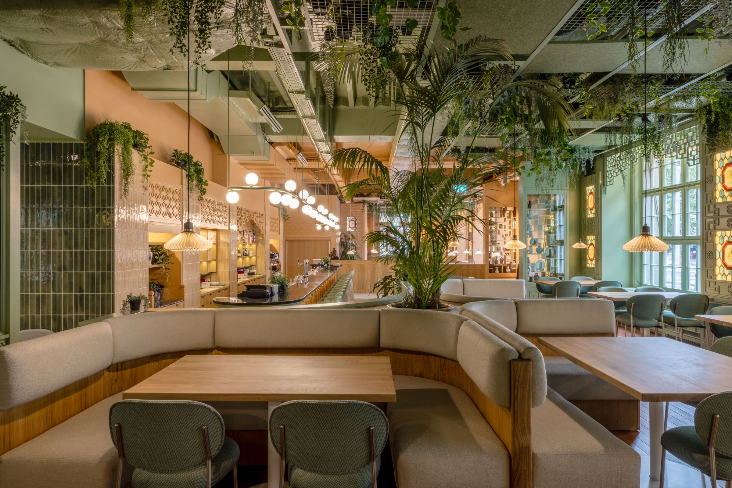
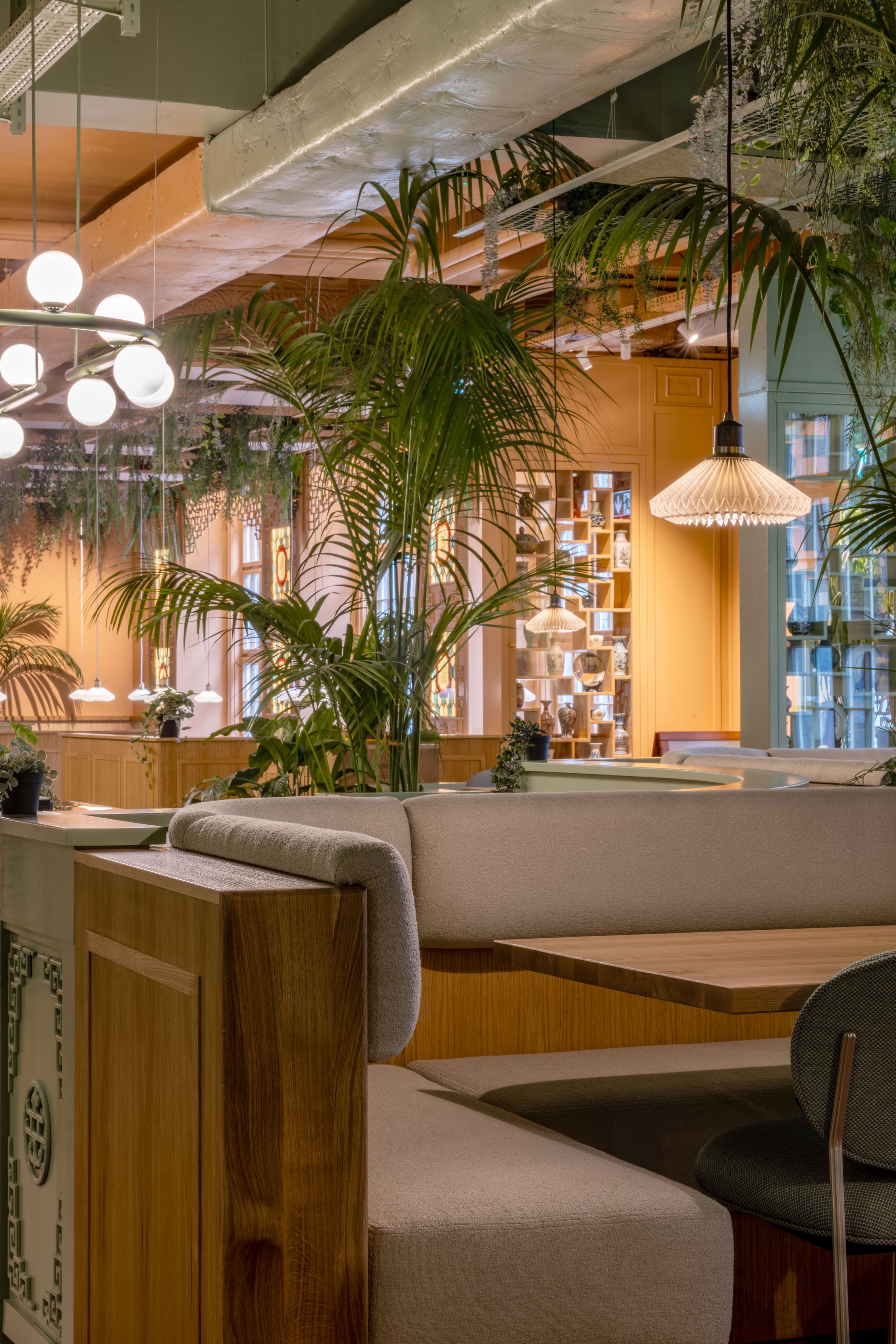
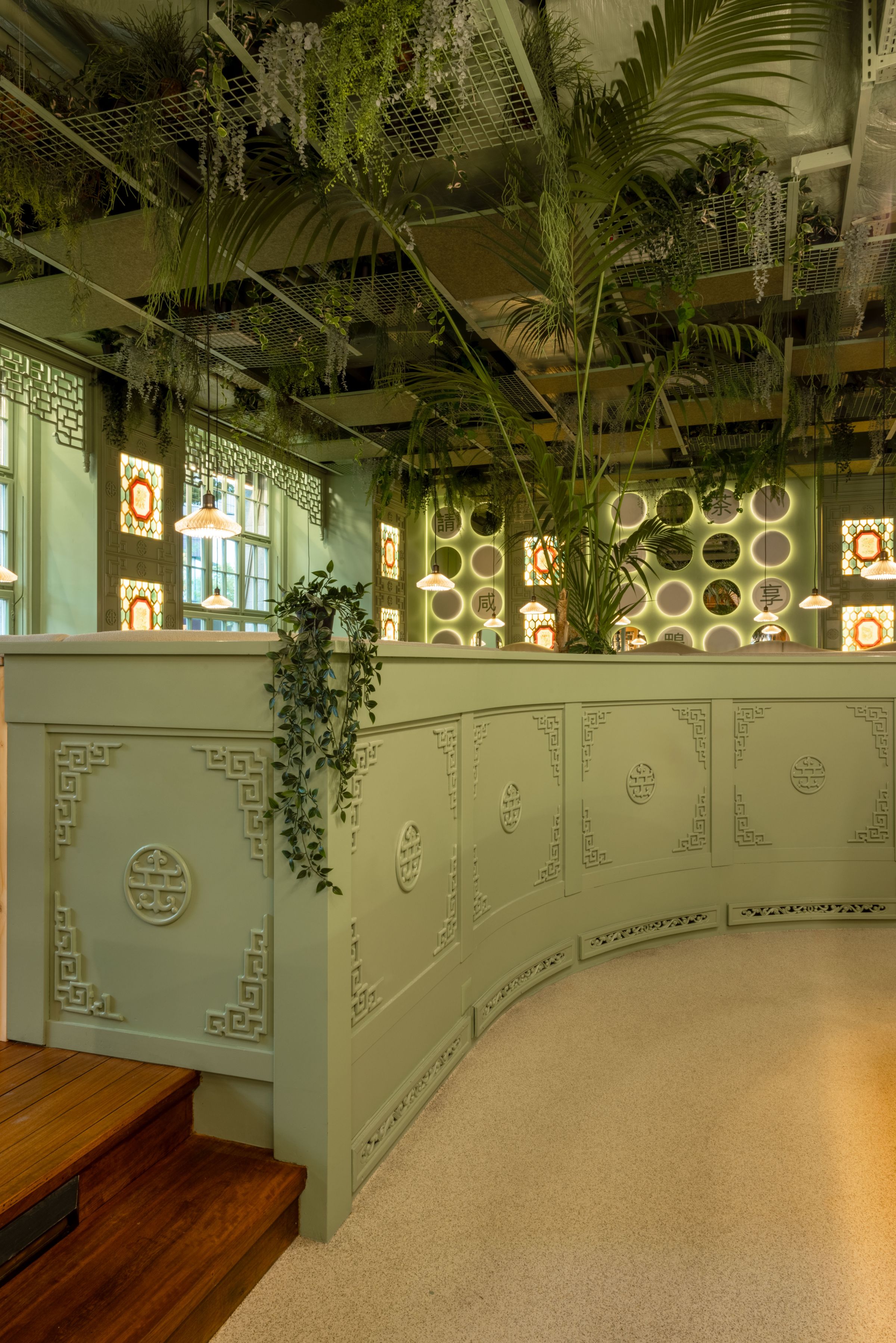
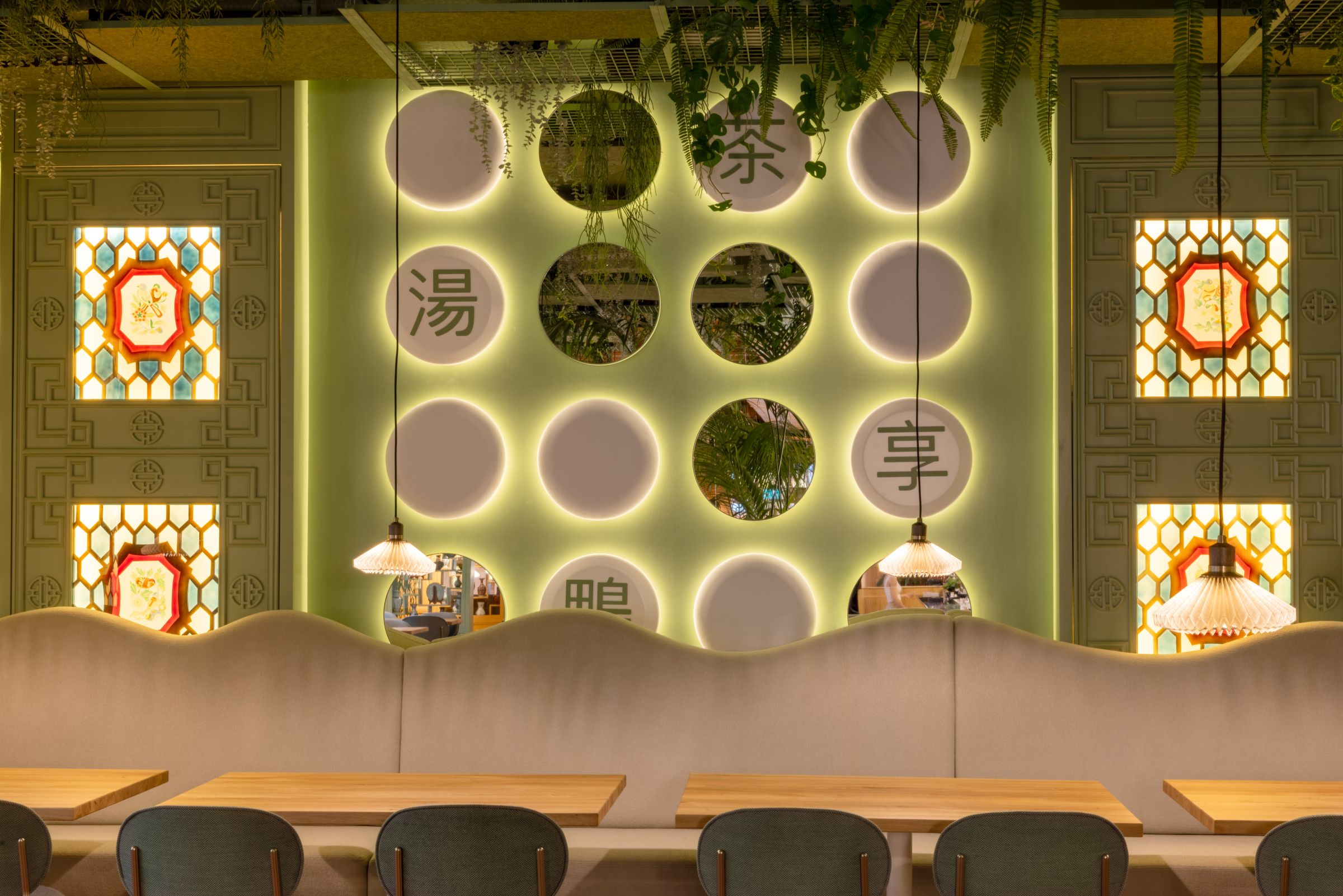
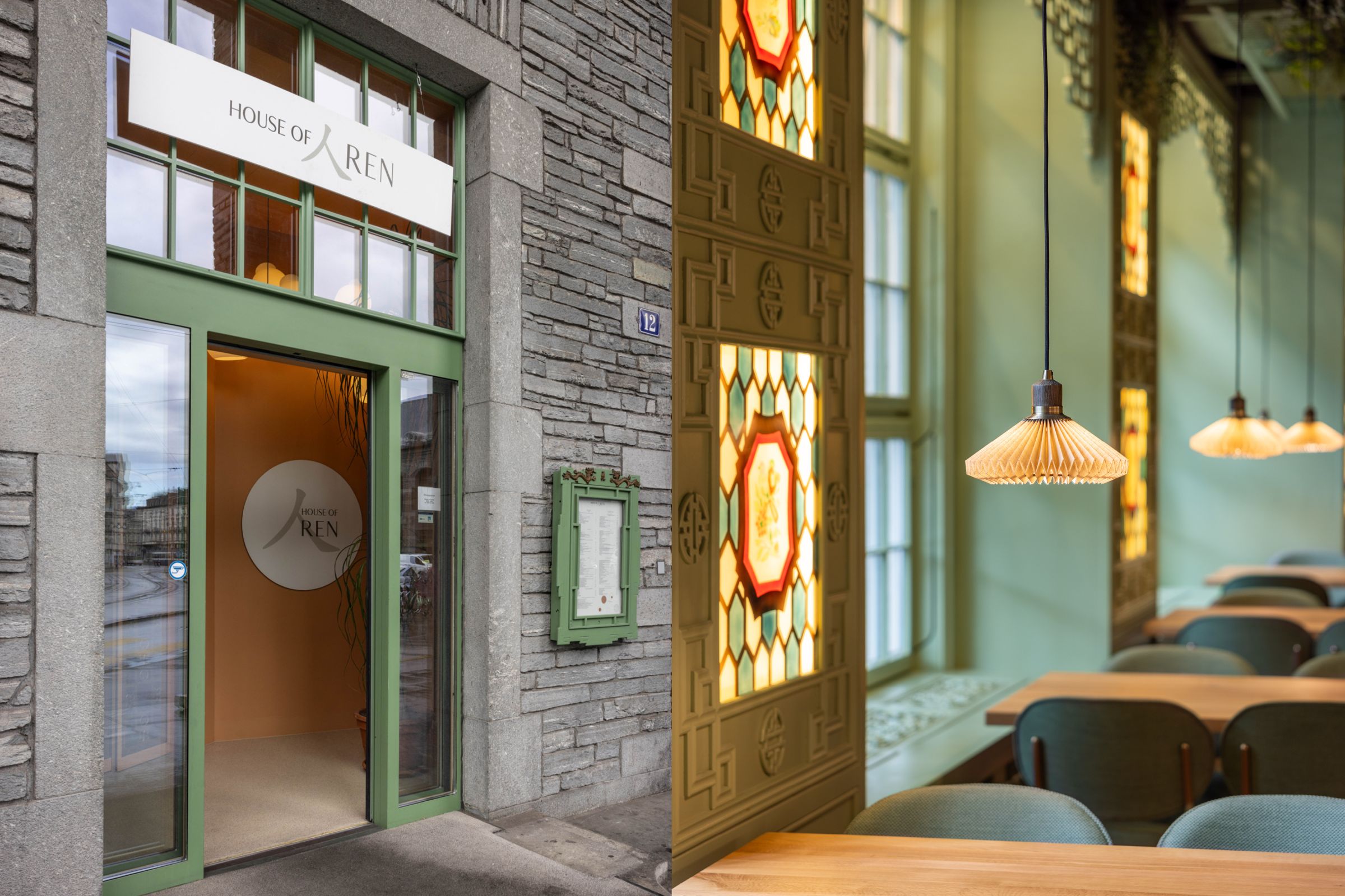
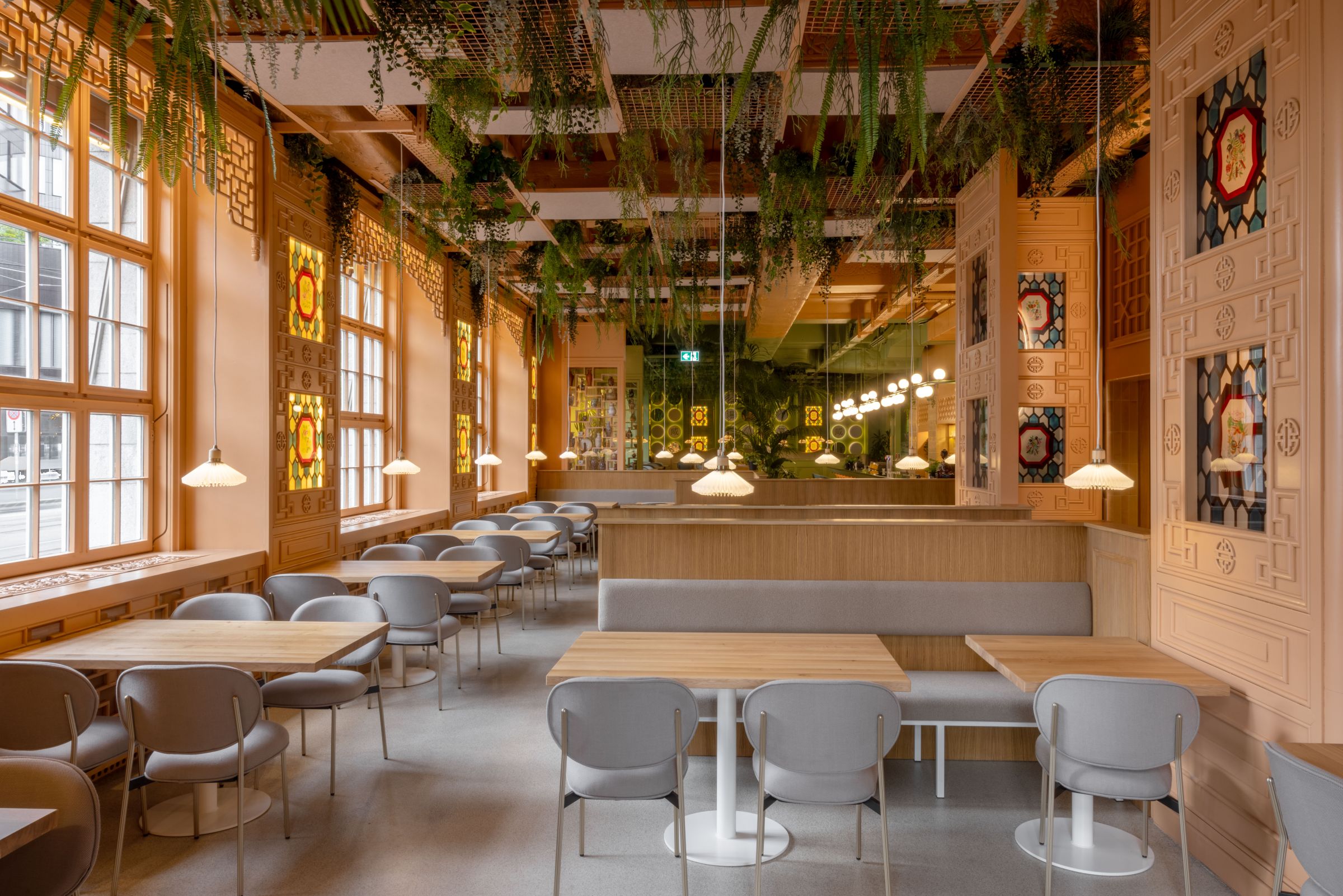
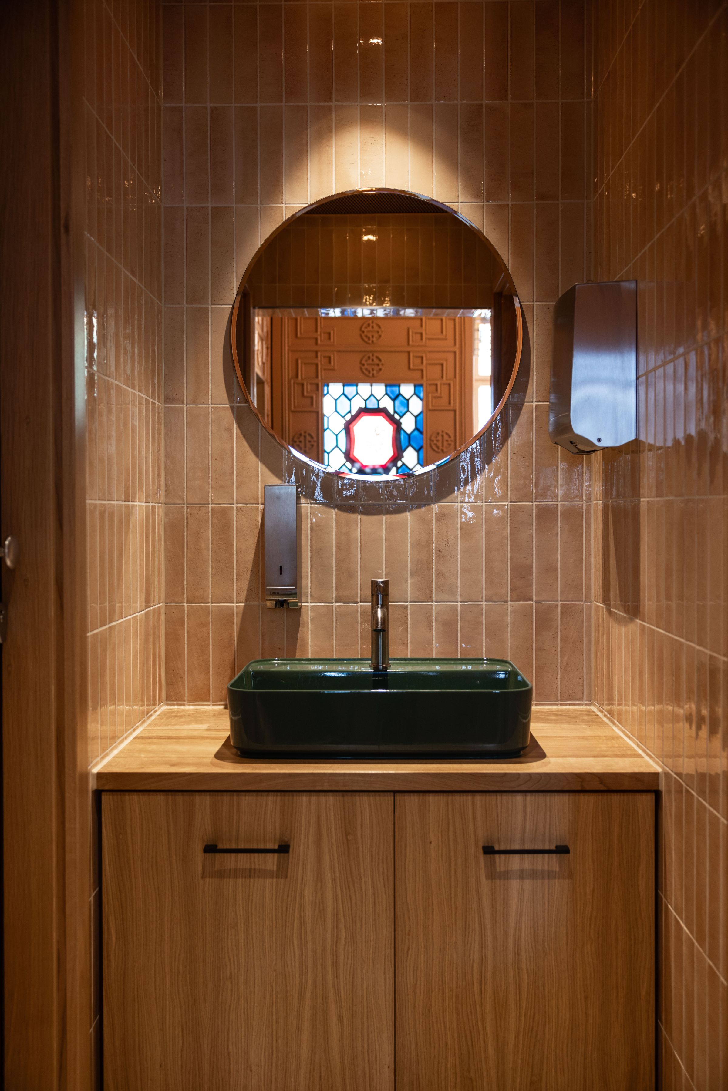
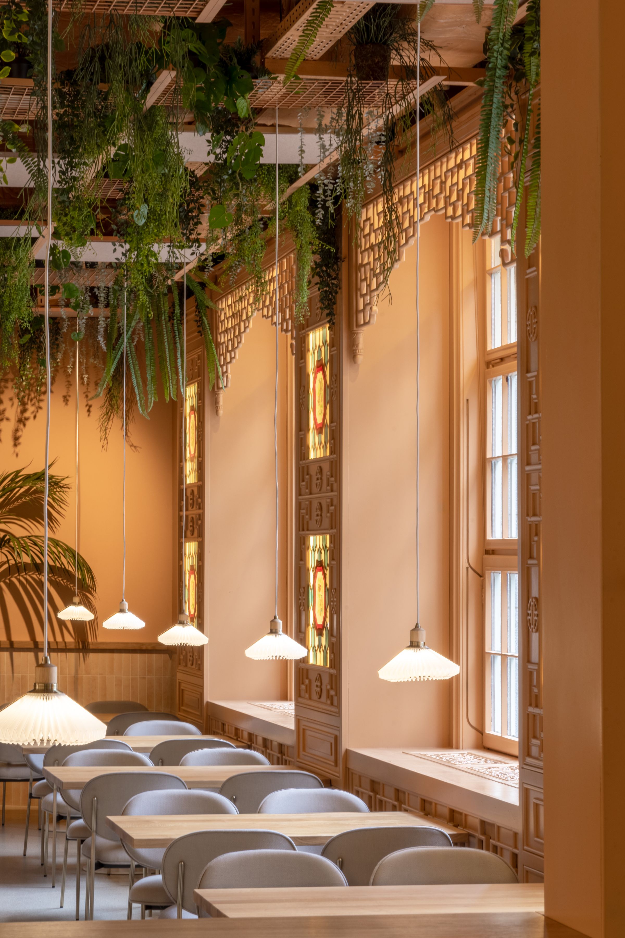
With preserving the heart of its heritage, the old Chinese woodwork and carpentry have been retained. However, rather than the conventional dark wooden tones, the space got infused with modernity. The woodwork now boasts terracotta and sage green colourings, creating a stunning contrast that elegantly divides the restaurant into two distinctive sections.
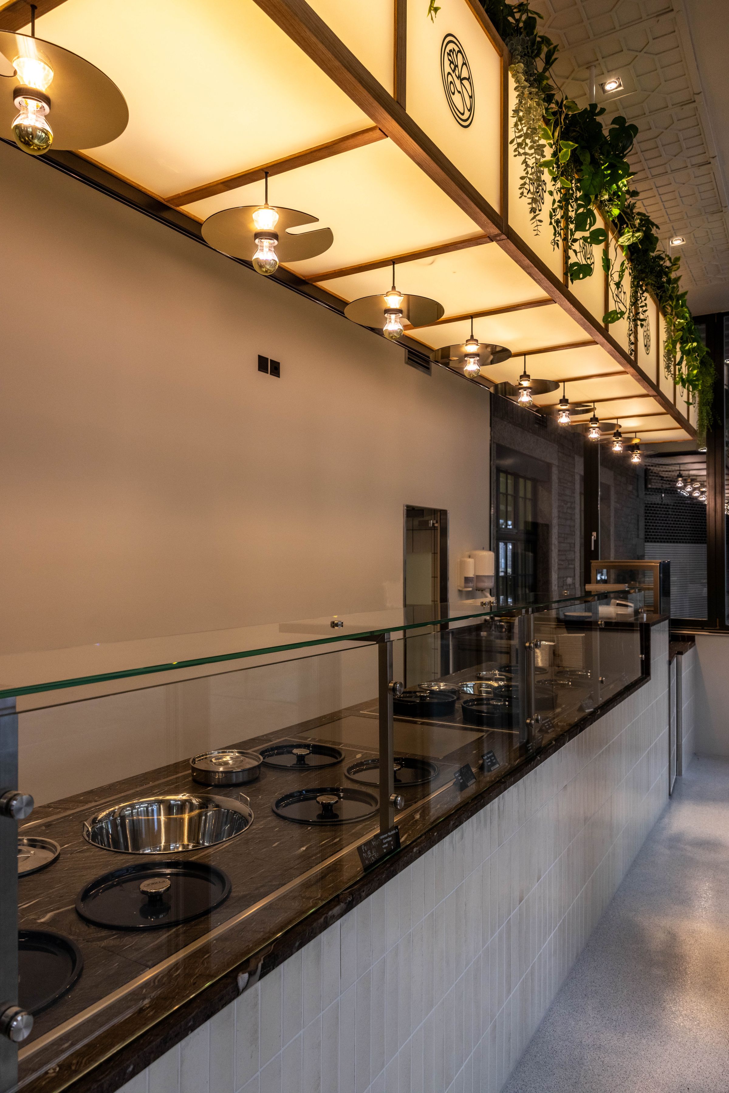
Tailored designs grace the interior from the inviting custom-designed upholstered benches to the fascinating custom light fixtures illuminating the bar area. The resin floor, with its warm colour palette, seamlessly connects both sections, allowing a graceful flow throughout.
Look up, and you’ll find artistic ceiling panels and metallic grids decorated with lush green plants, contributing to both acoustic harmony and a natural ambience.
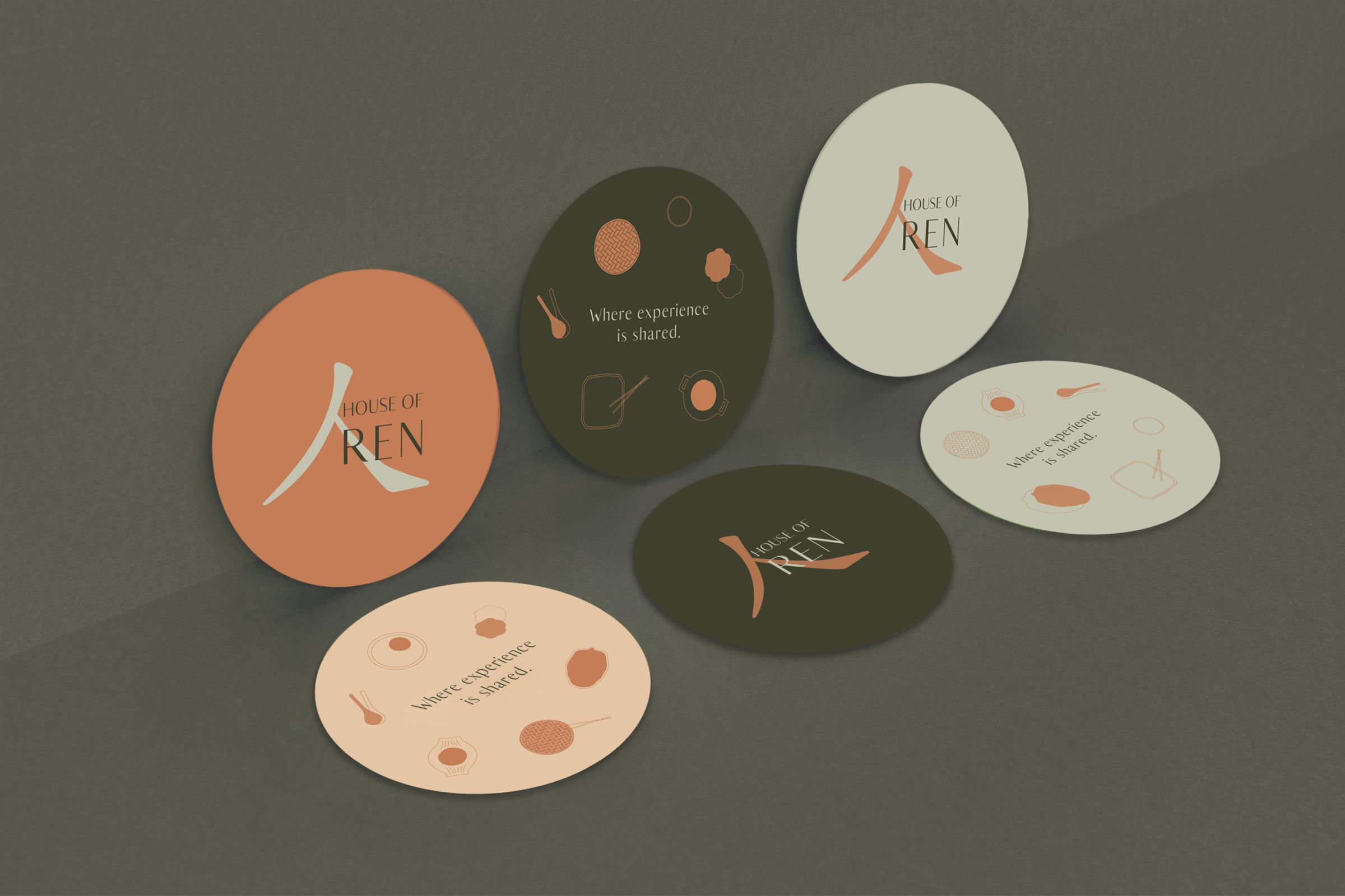
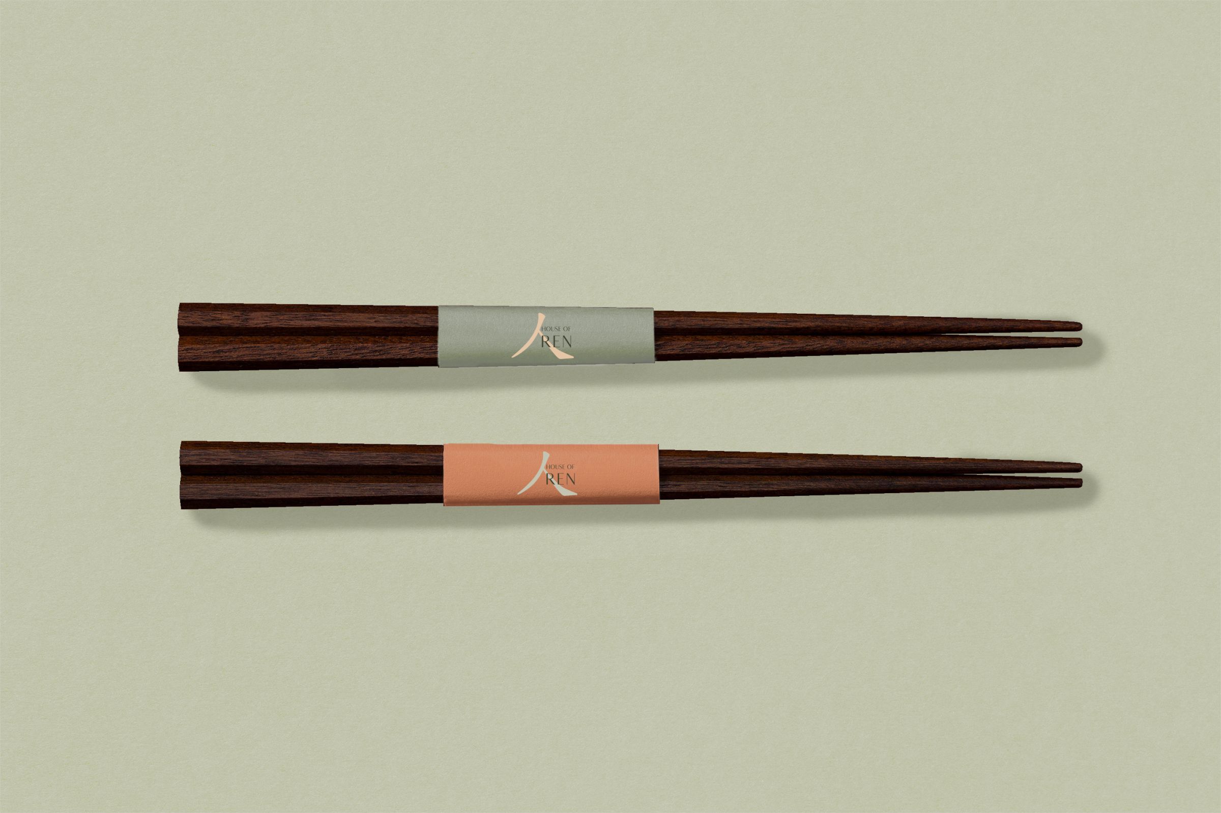
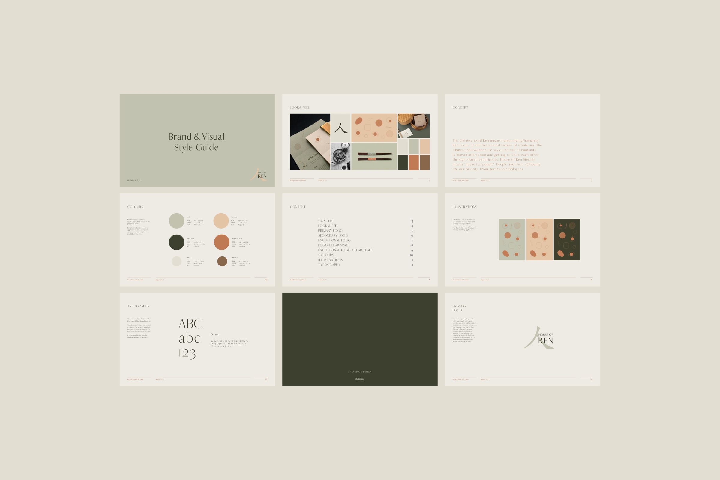
Uniting the whole space is the new comprehensive branding. The unique amalgamation of the Chinese calligraphy symbol and elegant typography breathes life into the name House of Ren, a heartfelt expression that translates to "house for people," embracing a welcoming space for everyone. Custom illustrations form an integral part of the brand's narrative, their unique charm creates instant recognition and association resonating deeply with its values and philosophy.

2023
Suan Long Enge AG
Zurich Enge
Interior Design, Building Execution & Brand Identity
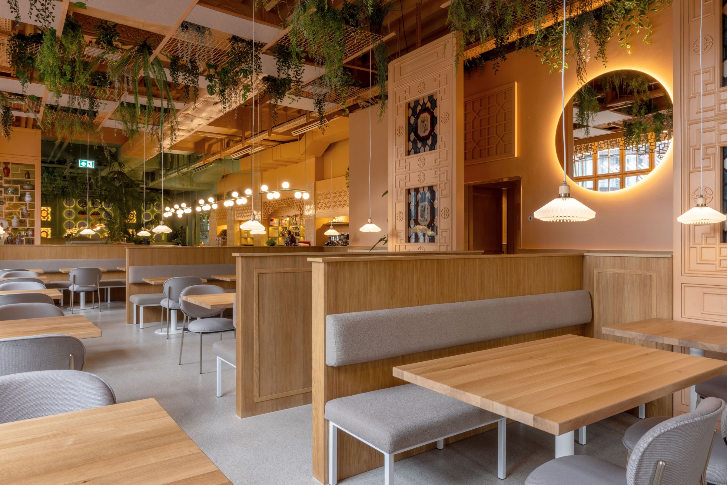
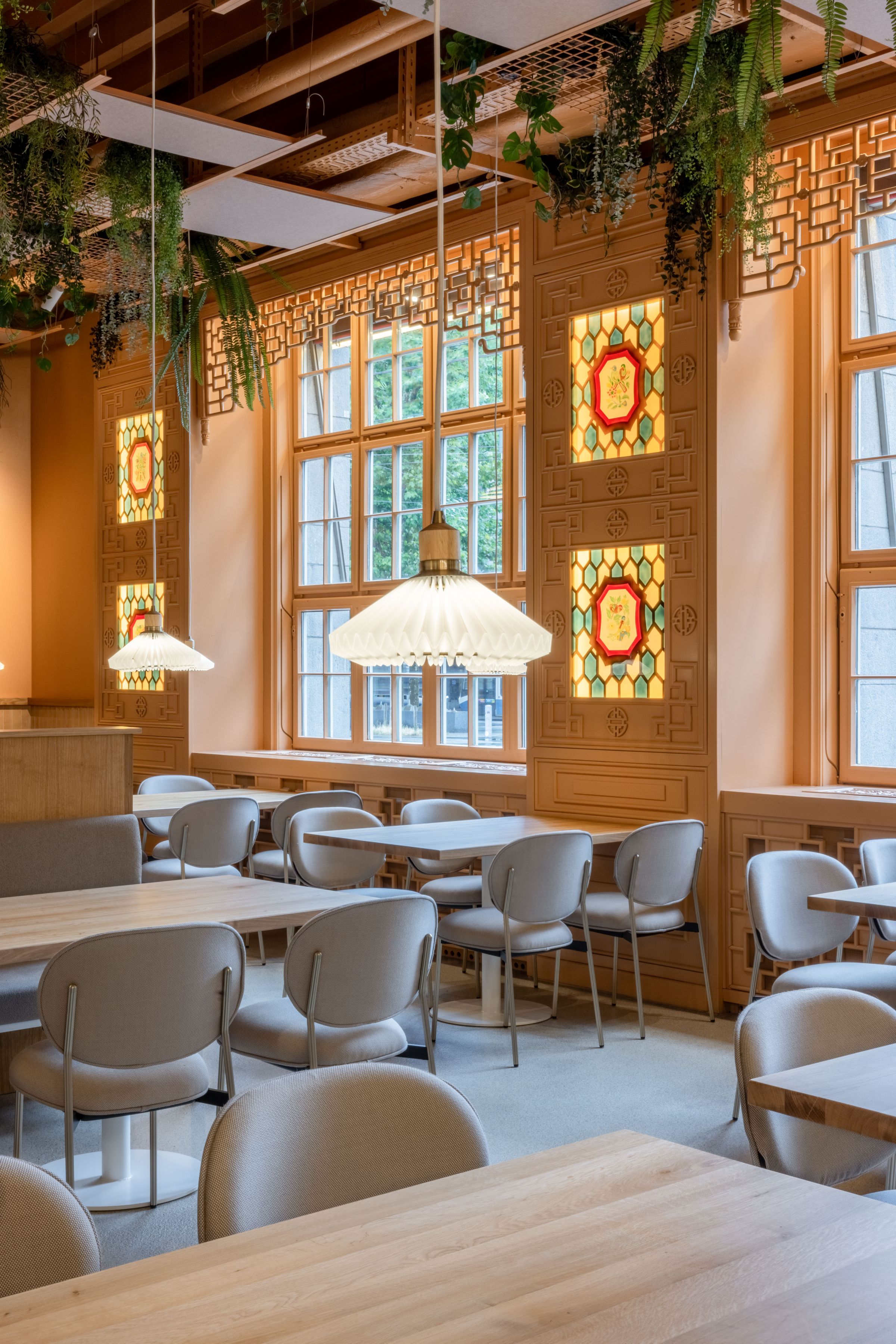
At House of Ren, immerse yourself in an exquisite dining experience that honours heritage while embracing modern design.
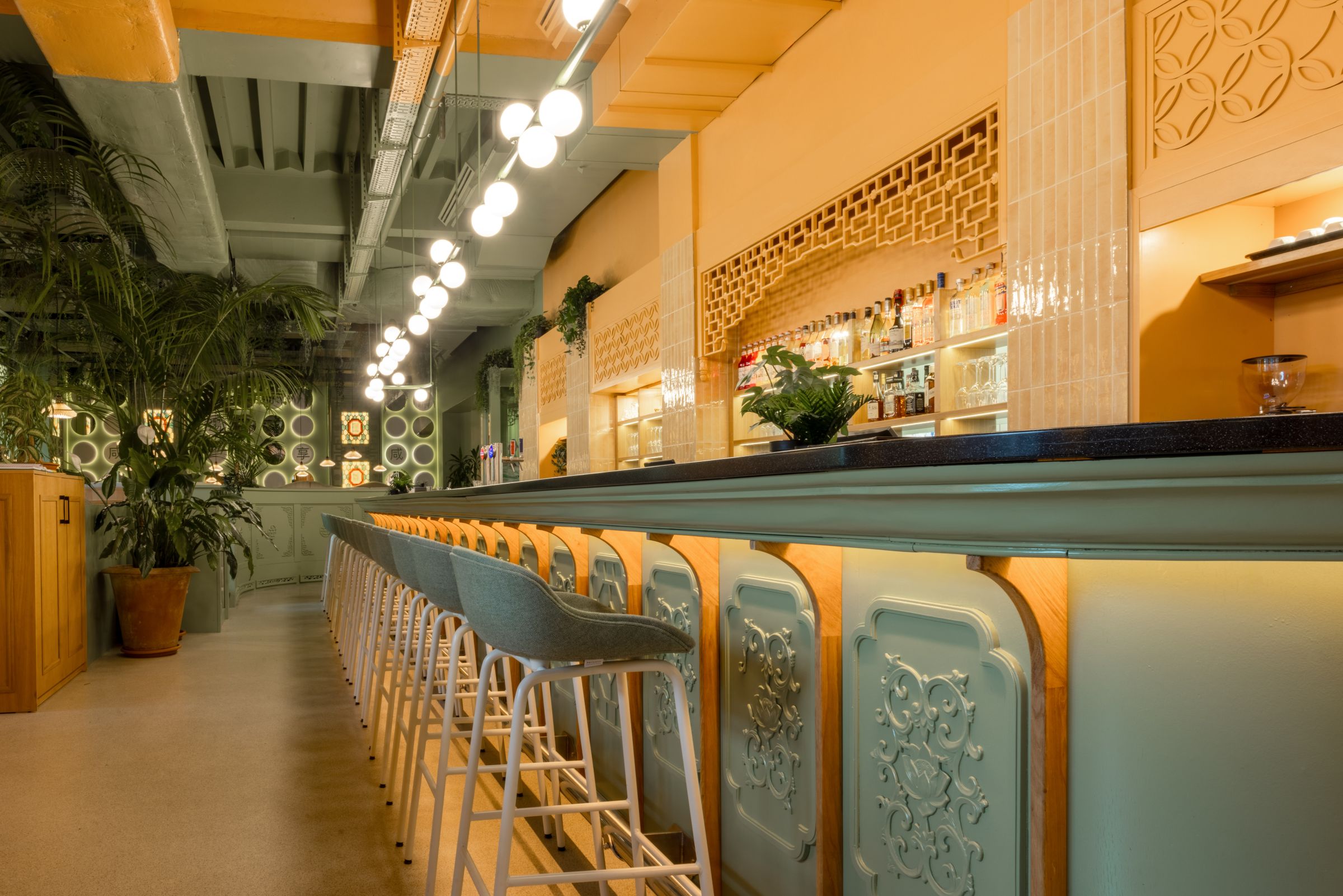
The existing bar painted in the same calming sage green, harmonises with wooden sections, exquisitely blending traditional Chinese decorations with contemporary touches.
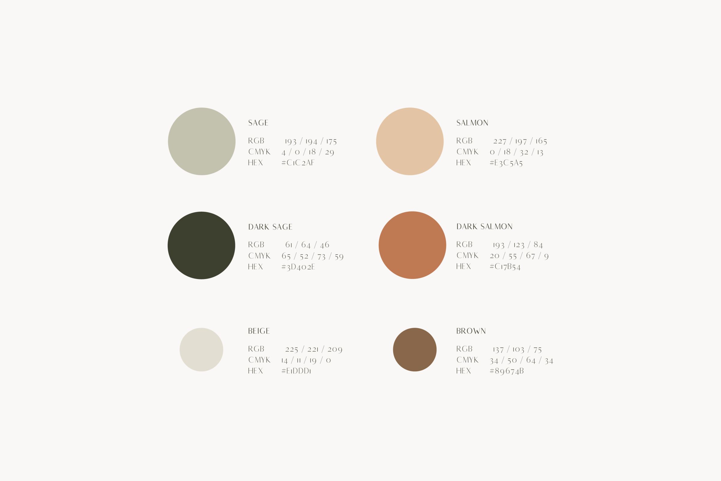
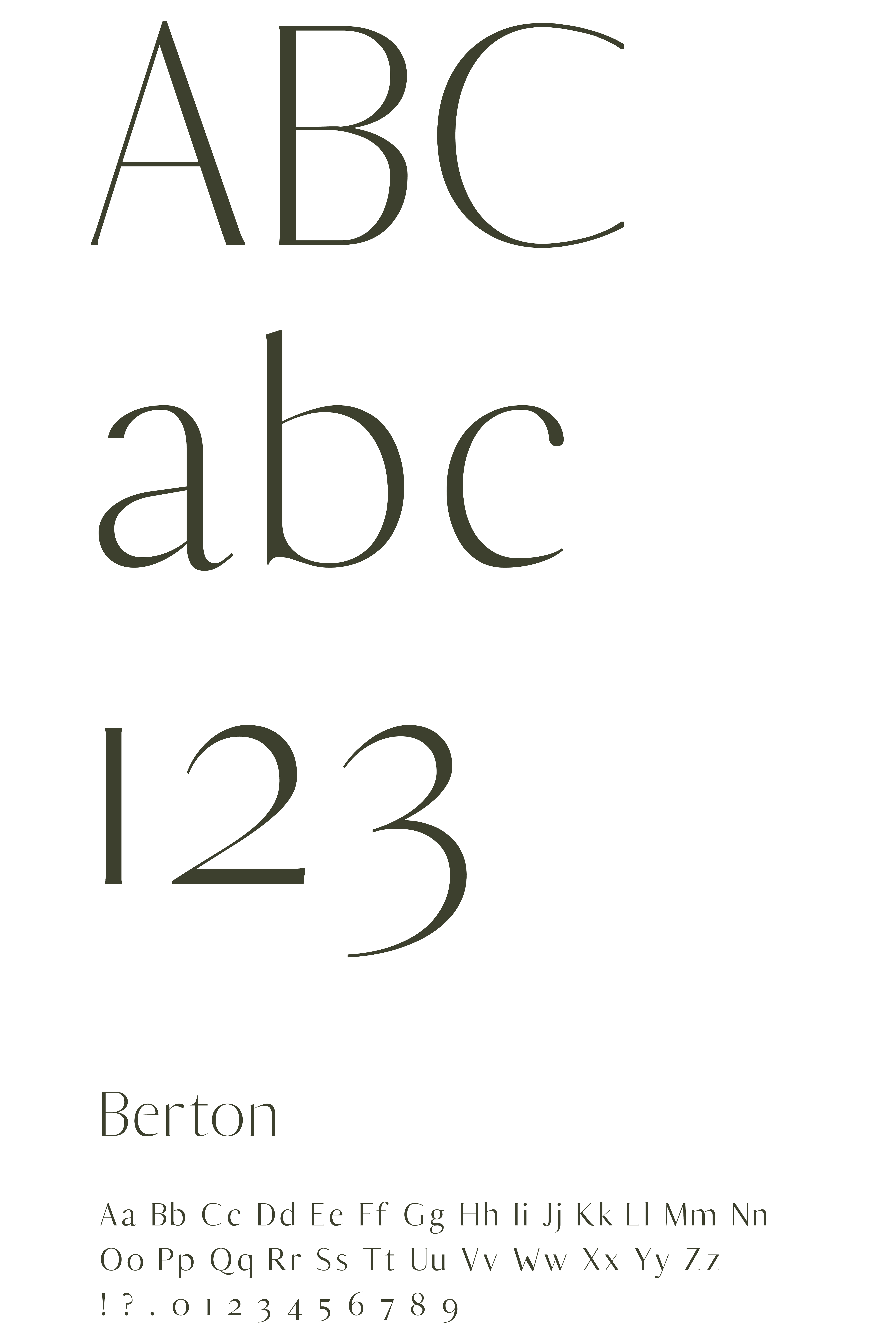
The exquisite font Berton unifies the House Of Ren brand identity. The elegant typeface consists of a set of three weights with high contrast in letter thickness.
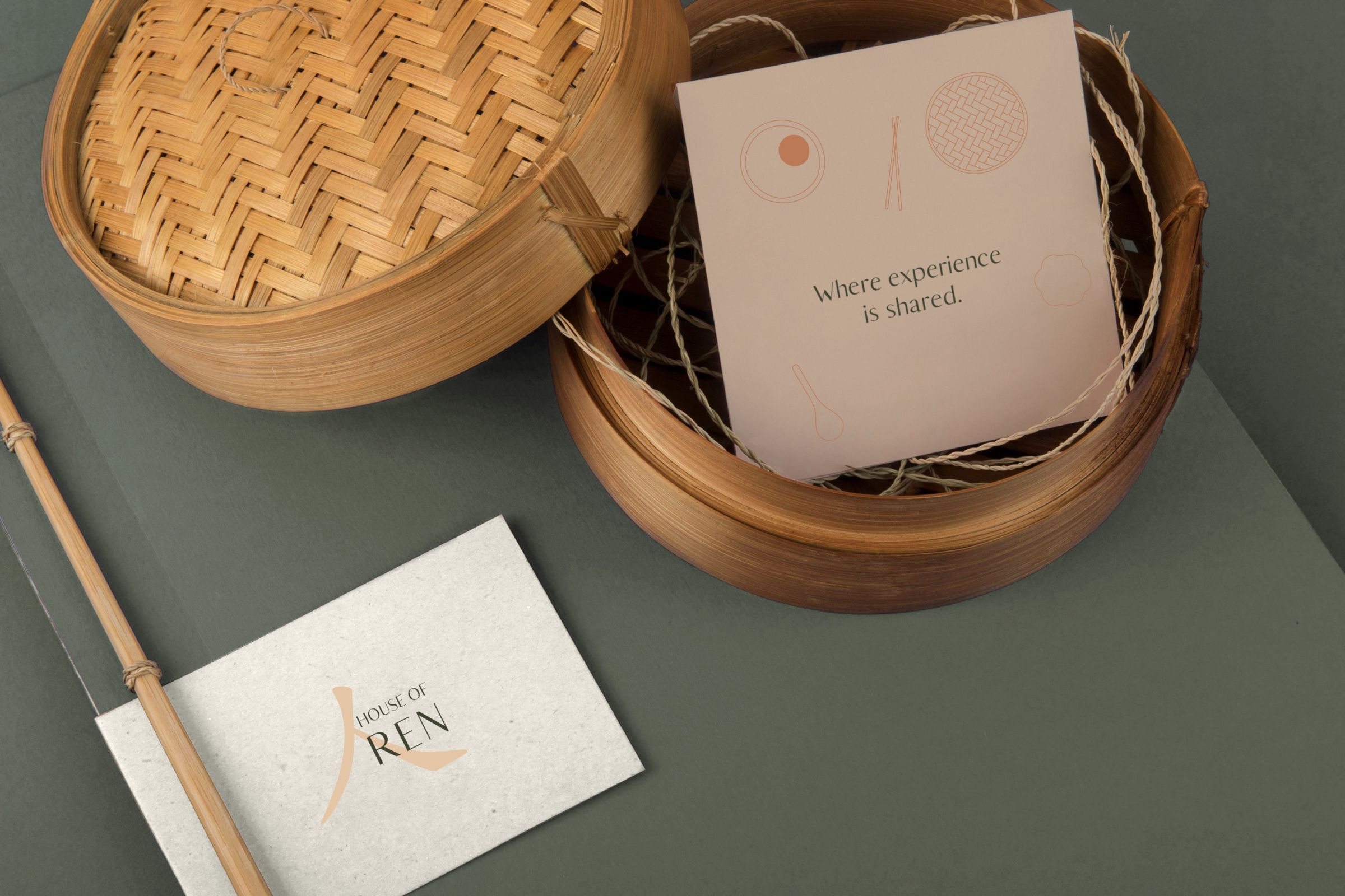
Custom illustrations form an integral part of the brand‘s narrative, their unique charm creates instant recognition and association resonating deeply with its values and philosophy.
Photography: Amanda Nikolic